Musical Instruments & Listening
Understand pick bands and blades on wearable picks
An explanation of the holding band and projecting blade on wearable picks, retaining differences in form and catalog naming without teaching fit or playing technique.
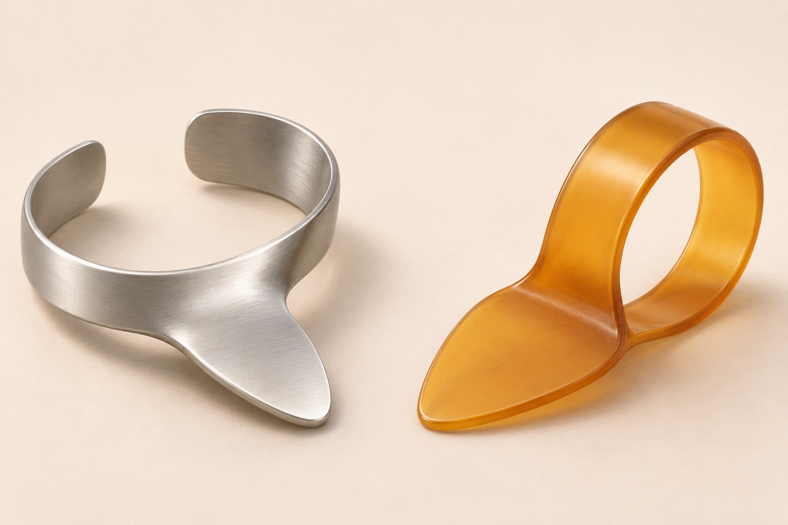
Understanding pick bands and blades gives a small wearable pick a more useful description than its outline alone. One portion curves around to form a holding band or loop; another projects as the blade. The interesting feature is their relationship within the same object. A loop can be easy to recognize while the projecting part has a quite different outline from the next example. This explanation follows that relationship through two documented forms. It teaches the vocabulary for a closer look, while leaving the choice of a wearing position or playing method to the applicable instruction.
Conceptual wearable pick anatomy; no exact retail model, handedness, fit, material, pack count or playing result is certified.
Wearable pick anatomy describes connected portions
For wearable pick anatomy, Joff Lowson's introductory banjo account uses a useful distinction: a band goes around a finger or thumb, and the blade is the portion used to play. That gives each word a role within the description. It does not identify the correct wearing position of an unknown retail item. Here, the distinction supplies names for the curved holding portion and the projecting contact portion.
It is tempting to draw a line between those portions and then imagine two separate components. That would add an assembly claim to an explanation of shape. In the simple illustration accompanying this article, the boundary is an annotation: it helps the viewer follow the form. It does not show a joint to undo, an interchangeable part or an instruction to separate anything. A name can identify a region of an object without implying that the region detaches.
Think of a blank outline drawing with two arrows. An arrow toward the curve answers “Which portion are we discussing?” Another toward the projection answers the same question somewhere else. Neither arrow needs to prescribe movement. This is the distinction that makes an anatomy illustration useful before a playing demonstration. It lets someone follow a written reference to a blade without mistaking every nearby curve for another tool.
Pick loop and striking surface belong in one description
The relationship between pick loop and striking surface is also described in Deering's discussion of picks. Its fingerpick account joins a blade-shaped striking surface to a collar, while its thumb-pick description pairs a flat striking surface with a bent portion. These descriptions retain different forms. They give no reason to redraw every wearable pick as an identical ring with an identical projection.
The words collar, band and loop can draw attention to a holding shape in an explanation, but they should remain attached to the account using them. If one source calls a portion a collar, that wording can be reported without silently changing the product name in another source. A clear explanation can retain both vocabularies. The reader then sees which expression names a physical portion and which expression identifies the particular entry being discussed.
A useful caption might say that a curved portion and a projecting portion are visible. A more ambitious caption might name a model, a wearing position and the expected result of using it. Those are different amounts of information. The modest caption can be useful on its own; it need not borrow the missing details to sound complete. Choose the description that the actual illustration can carry, rather than treating all possible questions as answered at once.
A looped form can retain a flat-pick-like blade
Dunlop's current HE-112 maker account describes a Flat/Thumbpick combining a traditional flat pick with a thumbpick loop. The combination matters to the vocabulary: the name preserves a flat-pick reference alongside the looped form. It is a description of that maker entry, not proof that every item labelled HE112 or every colored loop in a retail photograph is the same authenticated variant.
That example makes it easier to keep two questions separate when reading. “What portion am I looking at?” concerns the anatomy vocabulary. “What does this entry call the whole product?” concerns its name. The first answer does not have to reproduce the whole title, and the second does not have to explain every visible curve. Reading both answers together is more informative than asking a product name to do all the explanatory work.
For an illustration, this means the curved band should remain visibly connected to the projection. An isolated ring beside a separate triangular object would invite a different interpretation: two loose objects awaiting assembly. The cover instead presents continuous generic forms. Its purpose is to make the relationship visible at a glance, without adding a retail package, a measured specification or a demonstration on somebody's hand.
Keep the maker's naming inconsistency visible
The current Dunlop 3040T025 page has a heading for nickel silver right thumbpicks, while its description says nickel silver fingerpicks. Those words do not agree on the pick type. This article preserves that inconsistency rather than choosing one sentence as proof of a wearing digit or handedness. The maker wording is relevant to reading the account; it is not permission to supply the missing instruction.
When two parts of a reference differ, a tidy paraphrase can hide the very detail that needs attention. Writing down both expressions is more helpful than smoothing them into a single confident label. The result may look less compact, but it retains the reader's ability to see the disagreement. A sentence such as “the heading says one thing and the description says another” states a real limitation without pretending the entire reference has become unusable.
There is still something to learn from the form while that naming issue remains open. A broad explanation can identify which visible region it calls the band and which it calls the blade. It can stop there. The unresolved title does not require a lesson about putting the object on a particular digit, nor should the illustration be treated as an answer to that unresolved question. Vocabulary can be useful without becoming a fitting instruction.
Read these two retail accounts separately
The Dunlop 3040T pick listing advertises a fifty-pack. Each of its three originals presents one complete curled band-and-blade form. The repeated views do not inspect a fifty-item delivery. Stamped JIM DUNLOP and USA lettering is visible; the uncertain numeral reading does not authenticate the listed model or material.
The separate Dunlop HE112 pick listing advertises twenty-four. Its packet photograph shows overlapping colored forms and HERCO HE112 CN THUMBPICK MEDIUM COUNT24 wording. A small second panel presents four complete colored forms. Neither view authenticates an internal count, delivered inventory, material or equivalence between the pictured label and the native model.
Keep the names with their own photographs when comparing the entries. A packet label, a stamped marking and a catalog title are different observations. Combining them into one attractive composite would make it harder to tell which account supplied each detail. The same applies to a conceptual cover: its simplified forms help explain the relationship between portions, but cannot inherit a maker identity simply because it appears beside these links.
Read an outline without inventing a wearing lesson
Try a small exercise on paper: place the words “curved holding portion” and “projecting blade” beside a generic outline. The exercise is complete when the annotations clearly refer to the intended portions. There is no need to add a hand, a string or arrows showing motion. Those additions would change the question from naming the visible form to demonstrating an action. Keeping the drawing still helps preserve the narrower question.
Now imagine that the outline is turned on the page. The annotations should still refer to the same portions of the drawing, even though one is now nearer its lower edge. This is an exercise in following an annotation, not a statement about turning a real pick during use. Page orientation is a feature of the illustration. It does not establish a recommended orientation on a player.
If the drawing includes a fold line or a broken connection by accident, the reader might infer a hinge or a detachable blade. Correct the drawing rather than relying on a long caption to undo that impression. A simple concept image should carry its intended explanation clearly. That is why an editorial illustration deserves a check of the actual visible form, even when it makes no claim to depict an exact retail model.
Describe the relationship before comparing silhouettes
Two outline drawings can make the same vocabulary look different. In one, the projection could be drawn long and narrow. In another, it could occupy a broader area beside the loop. Those are hypothetical drawings used to explain the language; they are not dimensions of either retail product. The point of placing them side by side is to ask whether the description follows the visible relationship. An annotation that merely points toward the widest area could lose its meaning when the silhouette changes. An annotation referring to the curved holding portion has a clearer reason for being there.
Give the drawings neutral names, such as illustration A and illustration B. Calling them a beginner model and an expert model would introduce a ranking that the drawings do not establish. Calling one comfortable would introduce a use claim. Even a small heading can add an unsupported interpretation before anyone reads the explanatory paragraph. Neutral illustration labels leave room to discuss the form actually shown. They also let a reader disagree with an unclear arrow without having to dispute a claim about the quality of a real product.
This makes a useful final check of an anatomy caption: cover the product title and see whether the words still identify the intended portions of the drawing. Then uncover the title and check that it has been copied accurately from its own account. The two checks serve different purposes. One concerns the clarity of an explanation; the other concerns the fidelity of a reference. Passing either check alone leaves the other task unfinished. Together they help a reader move between a simplified illustration and a named source while keeping the meaning of each intact.
Leave instrument fit and other accessories with their own questions
The public capo instrument compatibility guide addresses a different accessory-to-instrument decision. Its instrument and variant questions are outside this anatomy explanation. Recognizing a curved portion on a wearable pick does not answer whether a capo suits a particular instrument.
The public loaded guitar pickguard fit guide concerns body geometry, mounting and a loaded assembly. A pickguard's name does not make its fit question a lesson about a string-plucking pick. Keep that separate accessory question with its own account.
A useful reading note at the end of this explanation would therefore stay short: identify the account, retain its actual product name, and describe the visible holding curve and projection in plain words. Mark any unresolved naming detail alongside it. That note records what this closer look established. If the next task is learning to play or selecting a fit, the note can travel with that question without pretending to have answered it already.