Home Decor & Table Settings
decorative bookends on a small shelf: let the books lead
Let a compact row of books guide the choice and placement of decorative bookends while preserving usable shelf space.
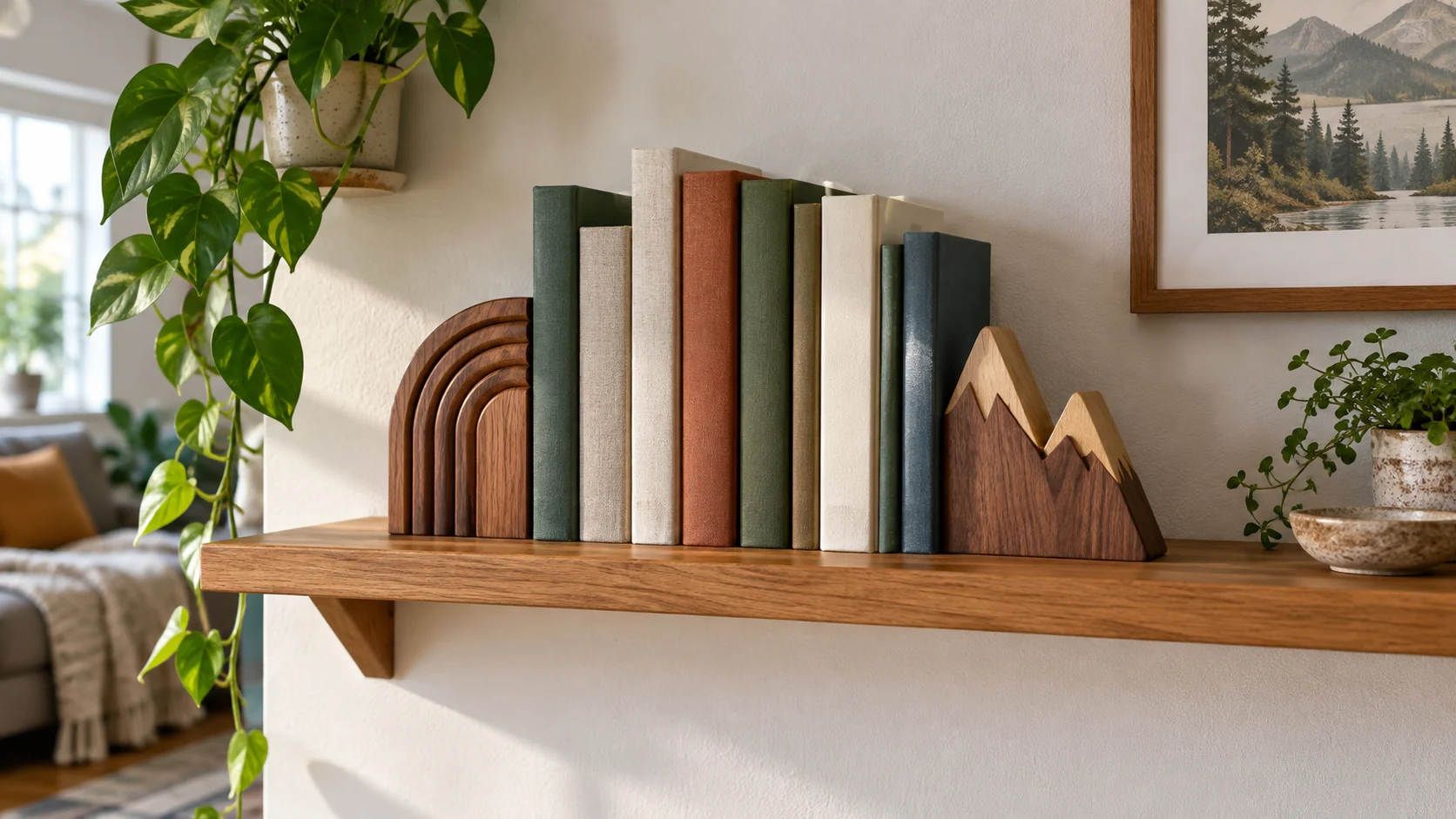
Decorative bookends on a small shelf work best when the books remain the reason the shelf exists. Choose one visible pair, leave enough room to take a book out, and let the ends frame a modest group rather than pack the whole surface edge to edge. The shape of a bookend can echo the room, but its footprint still occupies real shelf space. Plan for both the books you want nearby and the breathing room that makes the display comfortable to use.
A compact shelf is a good place to make one deliberate choice: a sculptural form, a warm material, or a quiet color. Trying to make each object the focal point produces clutter. Start with the volumes that belong in that room, set them upright, and see how much usable width remains. The resulting gap tells you whether a bookend pair belongs there at all, and whether its shape will be visible once the books are in place.
Let the books set the scale of the display
Gather the books you actually reach for. A small set of cookbooks near a dining area asks for a different arrangement from a row of slim novels beside a chair. Place the tallest or deepest books first and keep their lower edges on the shelf. Then group nearby volumes by a practical thread, such as current reading or frequently used reference, rather than sorting every spine only by color. A useful grouping is easier to maintain after someone removes a book.
Leave a little clear space where a hand can grasp a spine. When the row is pressed tightly between two heavy ends, taking one book out can disturb the entire arrangement. The gap need not be large or symmetrical; it only has to make normal use comfortable. If the shelf is already full, take a few volumes elsewhere before adding decorative ends. Styling is not a way to make an undersized shelf hold more than it should.
Think about the shelf's height as well as width. A short shelf under a framed picture may suit low bookends, while a taller open bay can carry a more noticeable silhouette. Check that the decorative profile will not be hidden behind the books or interfere with the shelf above. A shape that looks striking by itself can disappear once the row is complete, which is a useful reason to compare actual dimensions before choosing.
Choose a single material story
A repeated material can connect the books to the room without making every surface identical. Wood can pick up a nearby table, frame or plant stand. A molded sculptural form can add a different texture to an otherwise plain shelf. You do not need a matching set of accessories around it. One clear material relationship is enough for the bookends to feel intentional rather than assembled from unrelated spare objects.
Republeq lists Hidove Woodland Mountain wood bookends as a pair with a hand-painted motif, rubber feet and dimensions of 7.1 by 6.7 by 3.9 inches per piece. Those details make the pair a concrete example of a visible wood accent with a measurable footprint. They do not establish that it will fit every shelf or hold any particular collection securely. Measure the shelf and compare the actual books first.
The listed Hidove layered-arch bookends take another visual route: their description emphasizes a multi-layered arch form and a sculptural presence for a desk or shelf. The arch is the object you notice, so it may suit a display where the ends are visible. The listing describes its materials and support intent, but a product page cannot decide whether the form complements your room or how much usable width your particular shelf has after the books are added.
One of these forms could be the centerpiece of a shelf; using both in a single tight row would make the ends compete. The pictured example in this guide is a conceptual styling choice, not a claim that the two listings form a coordinated set or are meant to be used together. Choose the material and silhouette that work with the books already there, then let other objects nearby stay quiet.
Keep a reading shelf personal without turning it into storage overflow
A small shelf can hold a meaningful mix of current reading and old favorites, but it needs an editing rule. When a new book arrives, decide which one leaves the visible row. This keeps the display at a usable size and avoids pushing the ends outward each month. A rotation can reflect season or interest without buying more decor. The books themselves supply much of the color and texture.
The related holiday reading shelf guide focuses on the seasonal choice of new books and old favorites. That article owns the holiday reading edit. The question here is the everyday display around a compact group: where the bookends sit, how their material relates to the room, and how to preserve space for a hand to use the shelf after the arrangement is made.
A personal object can sit near the books, but give it a job in the composition. A small framed photograph at one end might balance a strong bookend shape; another tall object between the books and the end can obscure both. Try the row without accessories first. Add one object only if it makes the grouping clearer. Removing an object is often the quickest way to let the bookends and books read as a coherent display.
Do not feel obliged to align every spine at the same height. Variation can make the row relaxed, especially when a few books are chosen because they matter rather than because their covers match. Keep the bottoms on the shelf and the group easy to browse. If a very tall volume dominates, move it toward one end or give it a separate place. The point is a usable arrangement with a focal rhythm, not a strict height chart.
Use negative space as part of the shelf
On a compact shelf, an inch of clear surface can be more useful than one more small object. It separates the bookend silhouette from the side wall and gives your eye a place to rest. Negative space also makes dusting and pulling a book easier. Look at the shelf from the room's normal viewing distance, not only from directly in front of it. If the ends vanish into a dense row, move fewer books into the display.
Try one group of upright books rather than several tiny stacks. A short horizontal stack can work on a larger surface, but on a narrow shelf it may use the depth needed by the upright row and make the bookends feel unnecessary. If a stack is important to the room, give it its own open area. Do not place a bookend on top of books merely to create a layered image; the pair has a practical role on the shelf surface.
Color can help connect objects without demanding a perfectly matched palette. Notice a repeated tone in the book spines, shelf finish or nearby art, and choose a bookend that does not fight it. A wood mountain profile might add warmth to pale shelves; an arch profile can add a line to a simple arrangement. Those are design examples, not universal rules. The actual books and light in the room decide whether the result feels calm.
If the shelf is near a window, observe how daylight changes the display. A dark bookend against a dark wall may need more separation to show its shape. A pale object may blend into a white shelf. Move the group a little and reassess before adding another decorative item. Small shifts are reversible, and looking in ordinary daylight is more useful than judging under one dramatic lamp.
Texture matters at close range as well. A painted wood surface and a smooth sculptural arch can both be appealing, but they ask different things of the surrounding shelf. A rough basket, patterned wallpaper and many colorful spines already create a busy field; a quieter end may give it structure. A plain shelf and neutral books can afford a stronger silhouette. Set one candidate beside the actual row if possible, then judge it from the chair or doorway where you normally see the shelf. The decision belongs to that lived view rather than an isolated product image.
Check the footprint before committing to a pair
The visible width of a bookend is only part of its footprint. Its base may extend under the books, behind them, or toward the shelf edge. Set a paper outline or the actual piece in the planned position and compare it with the remaining depth. You should not have to balance a base partly over an edge to preserve room for the books. If that is the only way it fits, choose a smaller grouping or another shelf.
The related bookend usable-space guide deals with the separate problem of books that will not fit between a pair. Use its measurement perspective if your first arrangement is too tight. The present guide does not repeat that fit diagnosis; it asks how to make a compact arrangement look and feel intentional after the books and bookends actually fit.
Try the arrangement with the books in the order you expect to use them. Pull the middle book out and put it back. If the remaining row falls into the gap, reduce the group or adjust the ends. This is an everyday-use check, not a laboratory stability rating. A display that survives normal browsing will need less constant restyling, which matters more than a photograph taken once.
Do not infer shelf capacity from the mass of a bookend or the maker's language about sturdy support. The shelf, brackets and wall or cabinet have their own limits. Keep heavy books on an appropriate shelf and follow the furniture maker's load guidance. A decorative end cannot compensate for a weak surface. If the shelf visibly bows or shifts, remove weight and address the shelf rather than adding a stronger-looking pair.
Keep the finished display easy to live with
After you place the pair, step back. Can you name the focal point in a glance: the books, the bookend shape or a personal object? If everything has equal visual weight, remove one element. A small shelf rarely needs several themes at once. The most successful arrangement often contains fewer books than the surface could physically hold and a pair of ends that frames them without shouting.
Think about the shelf's relationship to the rest of the room. A bookend pair that echoes the shape of a nearby picture frame can feel settled without matching its color. A mountain motif may make sense near landscape art but need not turn the whole room into a theme. Leave enough visual distance between the shelf and a large plant or lamp so each object remains legible. That distance can be a little empty wall or tabletop, not a new purchase. The arrangement should feel like one small part of the room, with the books still ready to be read.
Over the next week, notice which books are actually removed and where they are returned. If the row keeps becoming untidy, the arrangement may demand more precision than the household wants to maintain. Put frequently used volumes nearest the accessible end and leave enough room to slide them back. Styling should support the way the shelf is used, not require a daily reset.
A compact book display can change without being rebuilt. Rotate two or three volumes, swap a nearby photograph, or let the same bookends frame a new reading theme. Keep the footprint check and the clear hand space. If you later move the pair to another shelf, measure again; the original fit and visual balance do not automatically transfer.
The practical choice is a pair you can see and a row you can use. Start with the books, compare the actual bookend footprint with the remaining shelf, and keep a little open space. A layered arch or a painted wood landscape can add character, but the character comes through best when it does not crowd the reading. Let the books and the room make the final call.