Home & Living
Christmas doorway garland: choose a calm green or red-accented frame
Choose the visual mood of a doorway garland from the approach, letting the door and nearby wreath stay visible.
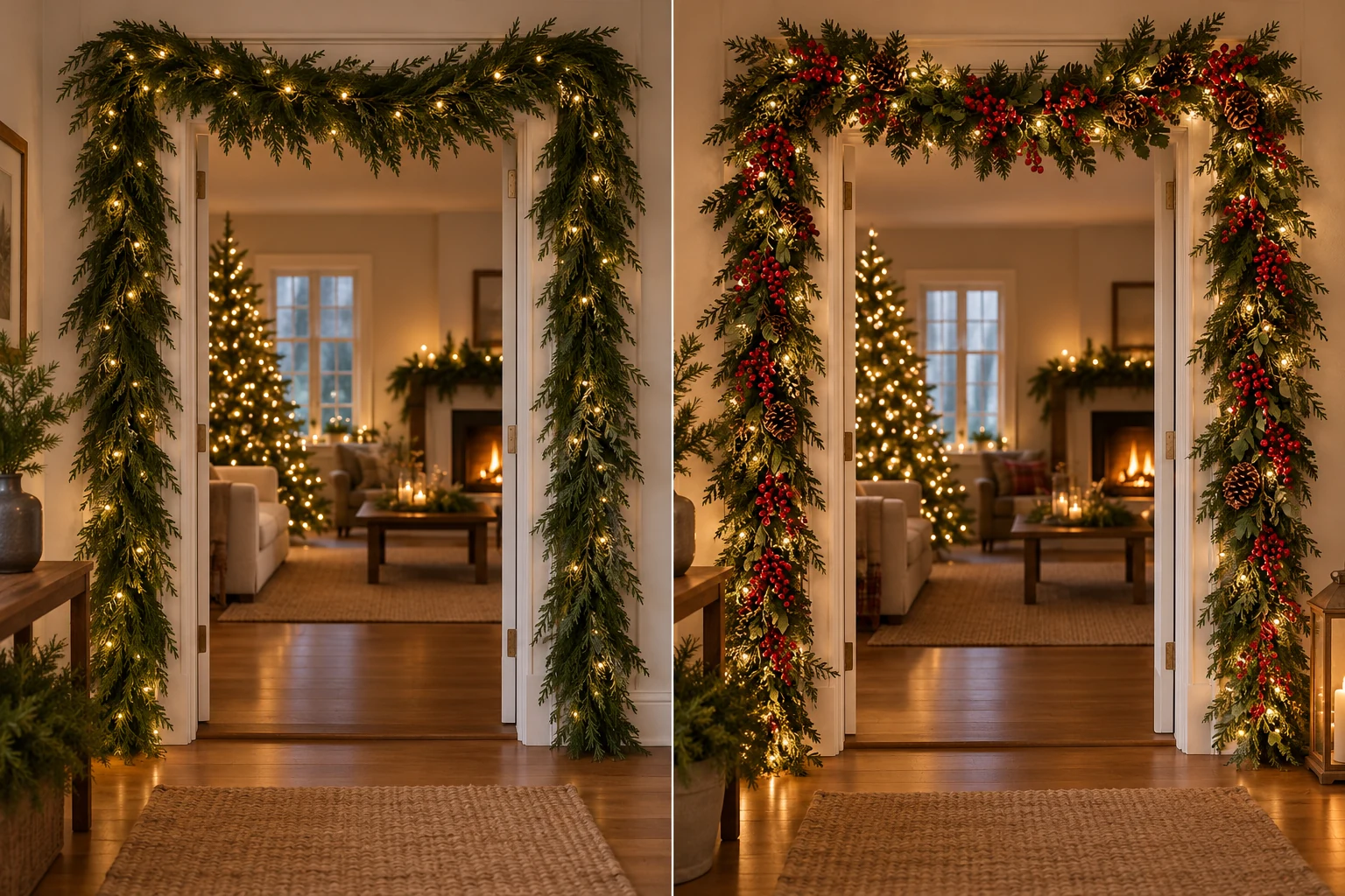
A doorway garland changes the first impression of a room before anyone notices the rest of the decorations. Two strands can feel quite different: one reads as a quiet green frame, while another brings red berries and bright points of light into the entrance. Choose the effect you want people to see as they approach, then let the door and nearby wall remain visible. This is a styling decision about color and attention, with the length and mounting decisions handled separately.
Look at the doorway from the approach
Stand where you first see the entrance during an ordinary day. That might be a hall, a porch, or the far end of a living room. Notice what already fills the view: the color of the door, the wall around it, a wreath, a lamp, or a nearby piece of furniture. A garland will become part of that existing picture. Take a photograph from the same spot if it helps you compare ideas later. The useful question is whether the doorway should feel calm and framed or become the brightest holiday feature in that view.
Move closer and look at the trim separately. A light-colored door with pale walls may need a darker green outline to make the frame visible. A darker door can make red accents stand out. These are observations to test in your own space, not rules attached to a paint color. Hold a small sample of greenery or a colored ornament near the doorway if you have one. Step back to the approach and check what your eye notices first. You can make a color decision without committing to a final installation.
Pay attention to the nearby decorations that will stay. If a wreath already has berries, a berry-rich garland can repeat that color. If the wreath is a single quiet shape, a simpler green garland may give it room. The same choice applies to a console table, runner, or artwork beside the door. You do not need every item to match exactly. A shared color or texture is enough to make the view feel connected. Leave some plain door and wall visible so the decoration does not turn the entrance into one dense block.
Compare a quiet green frame with a red-accented one
The Pruboru Norfolk-pine garland is listed at nine feet with LED lights. Its gallery shows a relatively dark green strand arranged around a doorway and a mantel. The photographed greenery appears simpler than a strand covered in large colored ornaments. That makes it a useful reference for a frame that lets the door and any existing wreath remain prominent. The listing's “dual-color” wording describes the faux greenery; this article does not infer two light colors or any specific lighting mode from that phrase.
The Lush nine-foot garland is pictured with red berries and pinecones among its greenery. Its listing describes warm-white lights, and the gallery shows the strand around a doorway, along a stair rail, and on a mantel. Those visible accents make the entrance busier even before you add a wreath or other nearby decoration. Use the gallery as an appearance reference, while checking the current product page for the exact version and contents. A photographed setup does not establish how it should be mounted in your home.
Place images of the two garlands beside a photograph of your entrance, or simply switch between them while looking at the doorway. Ask which color you want to carry into the room. A deep green frame may make the view feel settled; red berries can tie the entrance to red ornaments or ribbons elsewhere. Neither choice is automatically more festive. The best match depends on what remains in the scene. Keep this comparison about the visual character of one strand. The separate garland length planning guide handles the measured route before purchase.
Decide where the eye should rest
Look at the top of the doorway first. If the wall above it already holds a strong feature, a simple garland can keep that feature readable. If the area is plain, a richer strand can become the focal point. Then look down the sides. A door with a wreath, house number, or glass panels has its own center of attention; keep those elements visible in the imagined finished view. You can sketch a rough outline on a photo to see how much of the door remains visible. This is a composition test, not a mounting plan.
A doorway often sits between two different spaces. The outside view may be bright and open, while the inside is warm and full of furniture. Check both sides if both matter to you. A garland that looks restrained from the hall may appear more vivid when seen next to an interior wall. The opposite can happen when daylight falls directly on the greenery. Try the visual comparison at the time of day when guests usually arrive and again when the lights are on. This helps you choose for the actual scene rather than a single product photograph.
If you use a wreath, decide whether it leads the view or supports the garland. A red wreath with a red-accented strand creates a strong repeated color. A plain wreath with dark green greenery may keep the door quieter. Try one arrangement in a quick sketch or with items you already own. Then remove one visual element in the sketch and compare. If the door suddenly becomes easier to see, the original composition may have been crowded. You can choose a simpler strand or reduce nearby decorations without changing the doorway itself.
Check the scene in ordinary light
Holiday lights can change how greenery reads after dark. Compare the light color you can verify on a current product page with the room's existing lamps and any wreath lights. A photograph may exaggerate brightness, especially when the rest of the room is dim. Think about the view from where you actually stand. If the doorway already has several bright points, a less decorated strand may keep the entrance from feeling visually noisy.
Take a daytime photograph from the approach and another after the room lights are on. Use them as a memory aid rather than as proof of how a purchased garland will perform. Exposure settings can make lights look brighter or dimmer than they do in person. What the photos reveal well is the distribution of color: whether red accents collect in one area, whether a wreath gets lost, and whether the doorway outline remains visible. Make the final judgment in the room. You are choosing an atmosphere, not trying to reproduce a seller's staged image.
Think about the other holiday colors that appear in the same view. A red rug, ribbon, or nearby tree may already bring enough red to the entrance. A green frame can connect those items without adding another large red shape. If the room is mostly neutral, a berry-rich strand may supply the accent you want. You can put small color swatches on a photo, or hold a familiar decoration near the door while you stand back. The point is to compare the whole scene before assigning the garland the job of carrying every holiday color by itself.
Leave the installation decision separate
Once you have chosen the visual role, measure the exact route and confirm the current product dimensions and components. A listed length is a starting fact, not proof that a strand fits a particular doorway. The length guide linked above owns that practical measurement. Check the mounting method, surface, power arrangement, and any other installation details against the product maker's instructions for the specific item. This article makes no claim about a safe fastener, supported load, weather rating, or electrical setup from a photograph of the finished display.
Do not infer that a garland shown on a door, rail, or mantel can be used interchangeably in every home. The images show appearance and possible settings; your surface and the seller's instructions decide what is suitable. Keep a note of which side of the doorway you want people to see, where the wreath remains, and which color accents matter. Those notes will still be useful when you complete the separate practical checks. They prevent the installation details from quietly changing the visual goal you selected.
If the room already has a layered mantel or a photo backdrop, keep that composition as its own task. The mantel and backdrop layering guide covers the relationship between separate strands in that setting. A doorway can work with one garland and a clear center of attention. Repeating the mantel's exact layers around the entrance may make both areas feel crowded. You can connect them through one shared color, such as green or red, while allowing each place to have a different amount of decoration.
A small trial with decorations you already own can make the style decision easier. Place a wreath or ribbon near the doorway in its usual position, then stand back and study what color it adds. If the wreath already fills the center, imagine the garland as an outline around it. If the center is plain, the frame can carry more color. Remove the trial decoration and look again. That quick change shows how much of the mood comes from the garland and how much comes from the rest of the scene. It also keeps you from buying two decorations to solve one visual gap.
Choose the view you want to keep
Return to the approach and imagine the doorway with the chosen strand, existing wreath, and nearby objects. Decide what should catch your eye first and what should remain in the background. A calm green frame can make the door itself the focus. A red-accented strand can make the frame the holiday feature. Both can work when the rest of the scene has room for them. If neither image feels right, simplify the surrounding decorations or look for another garland appearance before moving to the measurement and installation steps.
Keep the decision written in one sentence: the entrance should feel quiet, colorful, or somewhere between the two. That sentence is more useful than a long list of decorations when you revisit the product pages. It helps you reject a beautiful strand that belongs to a different room mood. After the practical fit and installation checks, look at the finished doorway from the same approach you used at the start. If the door, greenery, and any wreath still have clear roles, the composition has done its job.