Computers & Gaming
Text cursor hard to find? Review the Windows indicator
Review Windows text cursor controls against the particular edit position you want to locate, using a practice note rather than important work.
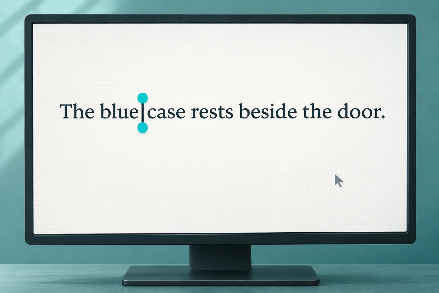
Text cursor hard to find while you are editing a familiar paragraph? Begin with the position you want to locate. You may be looking for the place to add a word, checking where an unfinished sentence continues, or returning to a note after looking elsewhere. Choose one of those ordinary tasks before changing the display arrangement.
This guide reviews Windows 11 text-cursor controls with a disposable practice note. It does not diagnose an eyesight condition, a faulty monitor or a keyboard problem. Use a computer you are authorized to configure, and leave important work out of the practice exercise. You can finish with the current visual choice if that suits the task.
Describe the edit position you want to find
Use the words in the document to describe the intended position. “Between blue and case in the first sentence” gives you a location to revisit. “Somewhere on the left screen” leaves the text itself unidentified. A sentence-level location also keeps the exercise small enough to follow without opening several documents or changing a whole workspace.
If you are unsure which mark you mean, describe what you were trying to do when you lost it. Were you trying to reach a control with the mouse, or find a place in a line of text before adding a word? You do not need to decide that a physical device has failed in order to explain the difficulty.
Microsoft's input-accessibility guidance separates mouse-pointer appearance from text-cursor controls. Its Windows 11 text-cursor section describes a colorful indicator and a separate thickness adjustment. This article follows that text-cursor section; it does not use a mouse-motion setting as the answer to the editing-position question.
Identify the application and the practice document you intend to use. If the difficulty occurs in only one particular place, keep that detail with the question. An observation from an ordinary note does not establish what every application or field will display. You can leave a different application's behavior for a separate enquiry.
Begin a text cursor indicator review
For a text cursor indicator review, Microsoft's Windows 11 route is Start, Settings, Accessibility, then Text cursor. Turn on Text cursor indicator and use Size while looking at the preview. Choose a recommended color, or use Choose another color for a custom one.
Read the controls on the computer in front of you before selecting anything. If the available route or label differs from the documented Windows 11 guidance, establish which instructions apply to your version. This article does not substitute the Windows 10 route simply because it appears elsewhere on the same support page.
Give the preview a particular question: can you readily locate the marker you have chosen to examine? You may prefer a modest marker or a more prominent one. The preference belongs to your task and the actual view. There is no universally correct color or size supplied by the two retail monitor accounts below.
Choose a color you can distinguish in the preview, then look at the intended editing context before settling on it. Avoid choosing solely because the color is your favorite or because it looks attractive in an isolated sample. You want to locate a particular position while reading the paragraph you actually use.
Consider the thickness control as its own choice
Microsoft separately describes Text cursor thickness, with its own slider and preview. Use that control when considering the bar's thickness.
Ask what remains difficult after looking at the indicator choice. Perhaps you can find the general location but still want a different-looking bar. Describe that visual preference directly. This is not an instruction to change every neighboring accessibility setting or to treat a large change as proof that the result must be better.
Leave a starting choice you can recognize while comparing an alternative. You may want to retain the earlier appearance after seeing another one. Make that decision from the actual comparison you performed. A preview you like can be useful without becoming a claim about readability in every document, application or lighting arrangement.
Judge insertion point visibility in a practice note
For an insertion point visibility check, create a disposable note with two sentences of your own. Here is an original example: “The blue case rests beside the door. A short message is on the table.” The words are invented practice material, with no real person's information or message waiting to be sent.
Choose one intended edit position before doing anything else. In the example, the exercise concerns the space between “blue” and “case.” Find that position using the application's ordinary editing operation, then look at the mark you are trying to follow. The exercise supplies no reported result for your computer.
If you choose to add a practice word, decide which word first and inspect the resulting sentence afterward. For example, you might intend “blue canvas case.” Check the actual words before describing the attempt as completed. Use only the disposable note for this check.
Use the second sentence for a separate location if that serves your question. You can ask whether you can find the intended position again after reading the other line. There is no need to turn the exercise into a timed test or claim an improvement in typing speed. Record only the particular visual choice and task you actually tried.
Look at the background you actually read
A practice paragraph should resemble the part of your work where the location becomes difficult to follow. If you usually edit a shaded comment area, examine an appropriate disposable example of that view where the application permits it. You do not need to change an important document's formatting merely to make the marker choice look satisfactory.
Compare the marker with the surrounding words as well as the empty space around them. Ask whether you can still read the particular sentence comfortably enough for the edit you intended. A conspicuous marker that you find distracting can remain a choice to reconsider. This exercise supplies no measured contrast score, prescribed palette or visual-accessibility certification.
Describe an answer in the terms of the view you checked. “I could locate the space beside blue in this practice paragraph” is a limited observation someone else can understand. It leaves other pages and applications untested. If a colleague is helping, show them that location and explain the difficulty instead of asking them to infer it from an entire crowded desktop.
Follow a fictional marker choice through the paragraph
Imagine that Lee is revising a short personal note and repeatedly loses the intended place in its first sentence. Lee chooses the disposable two-sentence example above instead of experimenting in the original note. The question is narrow: whether a chosen marker appearance makes that one intended position easier for Lee to locate.
Lee consults the Text cursor indicator preview, considers a different appearance and returns to the practice sentence. This is an invented sequence illustrating a personal choice, not a test report for either Sceptre model. Other readers have their own preference to assess.
Suppose Lee likes the new appearance in the practice note but finds it distracting in a different application. Keep those two observations distinct. The preference in one view does not need to be rewritten as a judgment about every view. Lee can retain a preferred choice, return to an earlier one, or leave the other application's question unresolved.
The example also leaves the words of the important note untouched. Lee can decide how to continue that actual writing task afterward. Locating a place in practice material does not determine which edit belongs in a real message, and this guide does not ask anyone to copy the fictional sentences into work they need to keep.
Keep the monitor accounts within their actual scope
The Sceptre E275W-QPT monitor listing identifies a black QHD monitor account. Its sole native image shows one flat black display on an open-ring base, with a SCEPTRE footer wordmark and a colorful lizard picture. No underside model label or measured display result is established by that view.
The Sceptre C325B-FWD240 monitor listing is a separate curved-monitor account. Its one native image shows an angled curved black display on an open-ring base, with SCEPTRE branding and illustrated rider imagery. The picture supplies no rider, motorcycle or software entitlement, and it does not authenticate an underside hardware model.
Neither native image shows the result of this Windows practice exercise. Catalog size, resolution and performance claims are not measurements of your text-cursor experience. Use an existing suitable setup for the review; no purchase of either monitor is a required step.
Leave a still-missing marker as a specific question
If you still cannot locate the mark in the intended context, describe that result plainly. Identify the application, the kind of editing location and the visual choice you examined. Take that specific description to the applicable help or the person responsible for the computer. It does not establish a reason to buy a larger display.
Distinguish a setting you cannot find from an appearance you dislike. In the first situation, you still need the correct guidance for the actual system. In the second, you have a visual preference to review. Combining them into “the computer does not work” makes it harder to state the next useful question.
A particular application's own editing guidance may be relevant when your question stays within that application. Consult the instructions that actually apply. This article does not promise that a Windows preview will appear identically in every field, supply a universal keyboard shortcut or diagnose why a particular program behaves differently.
Keep pointer motion and key remapping on their own paths
The mouse pointer speed settings guide separates pointer travel, wheel scrolling and double-click timing. Those are different questions from choosing a text-cursor appearance. Use that guide when the actual unwanted behavior concerns those mouse actions, rather than treating every mark on the screen as one control.
The keyboard modifier remapping guide concerns the action assigned to a key or shortcut. It does not choose the visual marker for an edit position. Keep the mapping question separate so that a difficult-to-locate mark does not become an unrelated change to the keys you press.
Finish with the visual choice you actually prefer
Return to the original editing task when you are ready. Describe the choice you intend to keep and any application-specific question still open. You can leave the practice note as practice, without treating its fictional words or an attractive preview as an answer about the important paragraph itself.
If the earlier appearance suited you better, retaining it is a complete decision. If a new choice is useful in the context you checked, describe that limited result. Continue with the actual writing you meant to do, and bring a specific unresolved marker question to the guidance that applies to that application and system.
Conceptual text-cursor illustration, not an exact Windows interface or a test of a retail monitor.