Bedding & Bath
Sofa corner throw blanket: choose texture or a playful print
Arrange one throw on a compact sofa corner using either quiet raised texture or a playful printed motif, then test it in everyday use.
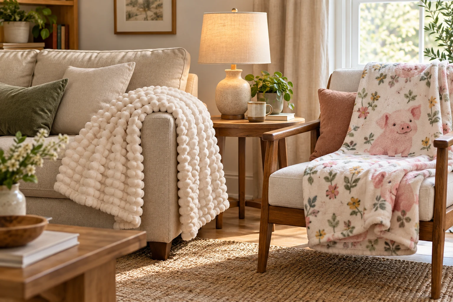
A sofa corner throw blanket can change how a small seating area feels without adding another piece of furniture. The choice is easier if you decide what the throw should do in the room before choosing a color or print. One person may want a quiet textured layer that softens a plain seat. Another may want a playful motif that gives the corner a clear personality. This guide uses a cream bubble-texture throw and a pig-print flannel throw as two concrete examples. It focuses on placement, proportion, everyday use, and the visual balance of the corner.
Give the corner one job first
Stand where you normally enter the room and look at the seat, the wall behind it, and the nearest table. Is this a place where someone reads for twenty minutes, where guests wait, or where a family member curls up for a film? The answer changes where the throw belongs. A reading seat needs an easy place to put the blanket after use. A guest seat may benefit from a folded edge that signals it is ready to use. Avoid arranging it so carefully that nobody wants to touch it.
Take a quick photograph of the corner before moving anything. A throw can look modest up close and dominate the room from the doorway, especially when a large graphic faces outward. The photo also reveals whether the seat already has a focal point: a patterned cushion, a picture, or a lamp with a strong shape. If so, the blanket can be a supporting layer. If the corner is visually empty, it may be the one element that carries the scene.
Clear the seat of extra pillows and temporary clutter for the first trial. You are testing the blanket, not the combined effect of every object that happened to be nearby. Put back only what earns its place. This small reset helps you notice whether the problem is a bare-looking seat, an awkward pile of soft goods, or no convenient way to store a blanket after someone has used it.
Read the two throws as different visual tools
The cream bubble-texture faux-fur throw is shown in its native listing as a light-colored throw with raised rounded rows. Its gallery shows it draped over seating and folded on a chair. That visible texture can add definition to a plain sofa even when the room uses mostly quiet colors. The listing does not establish how it will feel to every person or how it will wear in a particular household; use the images to understand its form, then check the exact care and material information before buying.
The pig-and-flower flannel throw has a very different job. The native gallery shows a large pig illustration, flowers, and prominent words as part of the printed design. It can make the seat feel personal and humorous, but the design will read as a statement wherever the front faces the room. Its listing describes a flannel throw; it does not prove that the print or fabric suits every style, age, or cleaning routine. Decide whether the recipient actually likes this exact message and motif before making it the room's focal point.
Both are whole throws for a seat or bed, rather than cushions or wall decor. Their meaningful difference here is what the eye notices first: surface relief on one, a specific printed character and words on the other. This is a styling decision, not a claim that one is warmer, softer, or better made. If you already own a similar neutral throw or a character blanket, use that item to test the arrangement before considering either example.
Test the view from the doorway
Start with the neutral throw if the room already has a bright rug, patterned curtains, or a picture you want to keep prominent. Lay it across one arm and let a section fall over the seat cushion. Fold enough of the fabric that the raised texture remains visible rather than spreading the whole throw flat. Step back to the doorway. If the seat still looks empty, widen the drape. If it looks bulky, narrow it and expose more of the upholstery.
Try the printed throw when the surrounding furniture is simple and there is space for a graphic cue. Spread only enough of the front to make the motif legible; the rest can rest in a loose fold. The image does not need to cover every cushion. A print with words is especially noticeable from across a room. Check whether the lettering is a welcome part of the setting and whether it would remain visible when the blanket is used casually rather than staged.
Take a second photograph from the same spot. Compare the two images without relying on how soft either blanket feels in your hands. Does your eye stop at the seat, then move comfortably through the room, or does the blanket overpower the wall and table? This test matters in a compact space because a single large patch of color or text can change the visual weight of an entire corner. The answer is personal, but the consistent viewpoint makes it easier to see.
Leave the seat usable
A blanket should be reachable without lifting a stack of cushions. Leave one part loose enough to pick up with one hand. If someone sits there every evening, try the arrangement for a normal day and notice where the throw ends up. It may land on the floor, cover the arm, or be folded on a nearby shelf. That landing place is part of the design. A basket can help only if it fits the room and people actually use it; do not add storage solely for a photograph.
The shared-bedroom reading light routine addresses where light falls and how two people use a room in the evening. For a sofa corner, apply the same habit of observing the actual routine without treating this as lighting advice. Sit down, reach for the throw, turn a page, and get up again. If the blanket blocks the light switch, drags across a side table, or must be rearranged after every use, change its resting place.
Keep the floor around the seat clear. A long drape can look attractive in a styled image yet become inconvenient where people walk. Fold the end over the cushion or arm so it does not trail into the path. If the blanket is primarily for use rather than display, a compact fold can be more sensible than a dramatic sweep. You can always open it out when someone wants it.
Check the seat from a seated position too. A high pile of folds behind the back can reduce usable depth. A folded throw on the arm might slip when someone reaches for a drink. Move it to the opposite arm or to the back where it stays out of the way. Small changes like these matter more than copying an arrangement from a listing image, which shows a staged room rather than your chair or sofa.
Balance texture and pattern nearby
With the cream textured throw, use one nearby surface to repeat its quiet color or shape. That might be the edge of an existing cushion, a light lampshade, or a plain ceramic object already in the room. You do not need a matching set. Let the raised rows be the texture and keep other fabrics flatter if the corner begins to feel busy. A single textured surface is often easier to read than several competing plush materials.
With the pig-print throw, let the motif speak for itself. A plain cushion behind it gives the picture and words a clear field. If the room already contains other figures, signs, or novelty prints, turn one of them away during the trial and see whether the corner settles. The goal is not to erase personality. It is to make the chosen motif visible without asking every nearby object to compete for attention.
The wallpaper mood-board guide examines how a favorite pattern can change role when its scale or placement changes. A printed blanket is movable, so use that flexibility: try it folded with only a small section visible, then opened wider. Do not assume a favorite graphic must cover the full seat. This article's decision is about the throw's place in a working sofa corner, while the wallpaper guide owns the wall-pattern decision.
Use the room's existing colors rather than buying accessories to justify a throw. A cream surface may pick up warm or cool light differently at different times of day. The pig design has several visible colors, so choose one quiet background color already present rather than trying to repeat every shade. Look at the corner in daylight and in the light you normally use at night. A choice that works only for a staged afternoon may not fit the way the room is actually used.
Make the trial easy to change
Before committing to a purchase, lay a similar blanket or a large towel over the seat to test the amount of fabric and the resting position. The substitute will not reproduce the listed texture or print, but it can reveal whether the arm is too narrow, a back cushion pushes the fold forward, or the throw covers a place where someone usually sits. Measure the useful space if the size in a listing matters to your plan. A nominal blanket dimension does not tell you exactly how much will show after folding.
If a print is the attraction, print a small photo of the proposed motif or hold the product image on a phone near the seat. This is a color and scale check, not a substitute for seeing the actual fabric. For the cream throw, drape a plain light blanket and judge how much bright area the corner can handle. These simple trials separate the room-layout question from claims about fabric performance that a photograph cannot prove.
Review the exact listing's current size, fabric, and care information before buying, especially if the throw will be used often or washed frequently. The native pages describe different materials and visual treatments, but the guide does not promise comfort, durability, or easy maintenance for a particular home. If the care information does not fit your routine, keep the styling idea and look for another throw with independently verified instructions. A good arrangement does not depend on a single product.
Choose the cue that still works after use
The cream bubble-texture throw makes sense when the seat needs a quiet layer and the room already has another focal point. The pig-print flannel throw makes sense when the wearer or room occupant enjoys that exact motif and the corner can carry visible words. Neither example solves a cluttered seat by itself. Remove unused objects, give the blanket a reachable resting place, and test how it looks after a normal evening rather than only when freshly arranged.
Keep one photograph of the version that worked and a short note about why: the fold stayed on the arm, the print was readable without dominating the room, or the neutral surface balanced a patterned wall. That record will help if you rearrange the furniture later. A sofa corner throw blanket feels intentional when its visual cue is clear, its place is practical, and someone can use the seat without first dismantling the display.