Home Decor & Table Settings
decorative vase arrangement: choose a pair or one blue accent
Use a real shelf or console to decide whether two repeated dark mauve forms or one blue accent gives the room a clearer display.
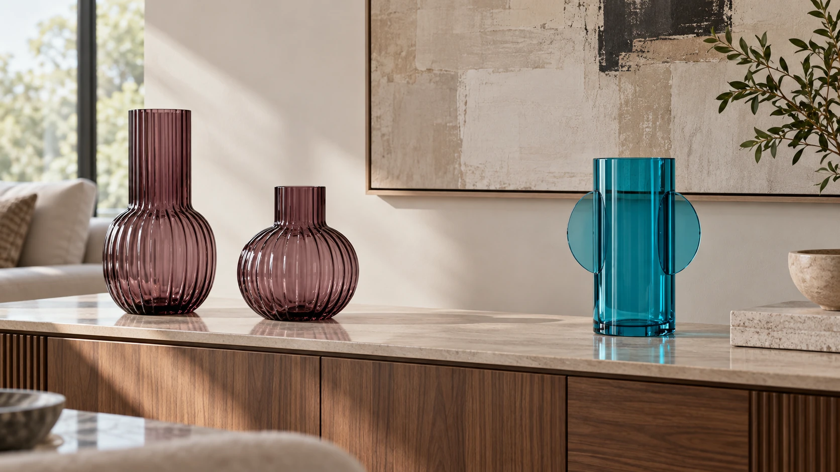
A decorative vase arrangement can change how a shelf or console reads from across a room. Before you buy a piece for that surface, look at what already happens there. A narrow console might hold keys every evening. A living-room shelf might be seen mainly from a chair, with books and a lamp beside it. The useful question is whether the space wants two repeated shapes or one clear focal object. The dark mauve Dorlow pair and the single blue Como vase offer a concrete way to test that choice, but your own surface decides how much room either arrangement gets.
Start with the surface you actually use
Clear the display area long enough to see its edges. Then put back anything that has a real job there: a lamp, a tray for keys, a book you regularly reach for, or a charging cable. Measure the remaining flat area. If the shelf has a lip, an outlet, or an overhanging frame above it, note those too. A product photograph usually gives an object empty space and a favorable camera angle. Your room has neighboring objects and people who need to reach them.
Draw a rough rectangle for the usable area on a piece of paper. You do not need an exact scale for an initial test. Mark the parts that must stay open, including the route to a switch or a drawer. If children or pets can reach the surface, include that practical constraint in the choice of location and follow the product's own care instructions. The aim is to find a stable, usable place for a decorative object before deciding which color or silhouette looks best.
Look from the doorway and from the place where you usually sit. A shelf that looks generous when you stand beside it may look crowded from farther back. Notice whether the surface already has a strong vertical element, such as a lamp or tall stack of books. A second tall object may compete with it. On a low, mostly empty console, an upright vase may give the eye a point to settle on. Make a note of those observations so the buying decision stays tied to the room rather than a catalog scene.
Decide whether the space needs a pair or a single accent
The Signature Design by Ashley Dorlow dark mauve glass decorative vase set is listed as two fluted vessels. That pair can create a repeated shape on a long surface. Try two paper footprints or two plain objects of roughly different heights where the vases might go. Leave a gap between them and step back. The gap is part of the arrangement; it allows the pair to read as a deliberate relationship rather than a cluster of things waiting to be put away.
The Jonathan Adler Como blue cylinder vase is a single acrylic piece with a more sculptural outline. Its blue and turquoise appearance can carry a focal role without a second matching object. Put one placeholder in the intended position, then remove a nearby accent if the shelf feels busy. The question is not whether one or two vases are more fashionable. It is whether the visible space benefits from repetition or from one stronger point of color.
Do not treat the paper shapes as a size certificate. The listing and the actual delivered piece must settle dimensions and condition. The mock layout is a way to decide where the piece would work and what you might move around it. If neither test leaves room for the surface's normal use, keep the shelf open and choose another location. A small clear area can look more settled than a larger group pressed against a lamp or a stack of mail.
Check the view in ordinary light
Try the proposed placement in the light you see most often. Daylight can make a blue accent prominent, while an evening lamp may shift the apparent balance of a dark mauve pair. The product photographs are useful for recognizing the offered shapes and listed finish, but they cannot predict every room's lighting. View the mock layout in the morning or evening when the room is normally occupied. Look for a color that connects to something already present, perhaps a rug, book spine, or textile, without requiring a forced exact match.
If the pair is going on a long console, vary the spacing before you add filler between the pieces. Putting a small item in every open gap can erase the rhythm that made the pair useful. If the single blue piece goes beside a stack of books, try moving the books slightly away or reducing the stack. You are testing visible weight, not creating a rule that every shelf needs a particular number of objects. The arrangement should still make sense when ordinary belongings return.
Photograph each test from the same position. A quick phone image can reveal that the pair disappears beside a large framed print, or that the single blue vase pulls attention away from a lamp you want to feature. Compare the images after a short break. The comparison is most useful when the camera position and light are similar. If one version looks better only because the shelf was cleared of everything you use, it has not passed the daily-use test yet.
Give the objects breathing room
Leave space around each vase for the surface's real tasks. On a console near an entry, check that a hand can reach the key tray without brushing a decorative piece. On a shelf near seating, check the view from the chair and the clearance needed to reach books. Keep the display away from edges where someone may bump it, and use any placement or care guidance supplied with the exact product. A styling plan cannot establish a material's resistance to falls, sunlight, scratches, or weather.
The Ashley listing describes a dark mauve glass set, while the Como listing describes a blue marbleized acrylic vase and includes care cautions. Those materials may look different in person from a screen image. Do not infer that either vessel holds water securely from its silhouette or photograph. If you plan to use flowers, ask the seller about water use and confirm the exact product instructions first. The display choice here works with empty decorative forms; it does not depend on a fresh-flower claim.
Pay attention to neighboring finishes. A reflective tray under a vase can change the effect of its color, and a textured book stack can make the same shape feel less formal. Test one neighboring object at a time so you can see what actually helps. If the shelf already carries a seasonal candle display, the autumn flameless candle shelf guide addresses the separate decision about light, batteries, and timer access. Keep that practical setup distinct from choosing a vase composition.
Use color as a room cue
Dark mauve can sit quietly beside neutral books or make a deliberate contrast against a pale wall. Blue can stand forward when most nearby objects are warm or subdued. These are possibilities to test in your room, not guarantees from the retail images. Take a small color cue from something already in the space and compare it with the product photographs. If you want a very close match, inspect the actual delivered piece in your own light before rearranging everything around it.
Two matching vases can be placed together, separated across a long shelf, or used on two nearby surfaces. Try the arrangement with placeholders before deciding. When the surfaces are far apart, the pair may no longer read as a pair from the usual view. If you value that repeated shape, keep them within a sightline that lets you see both. The single Como form has a different job: it can give one area a vivid point of interest. Surrounding objects can stay quieter so that one piece has room to register.
Look at the room as a whole before adding another accent solely to repeat a color. A blue vase need not force blue cushions, blue art, and blue books into the same view. Likewise, the mauve pair does not require a matched table setting. The throw pillow cover texture guide deals with a sofa's separate seating and fabric-fit decision. If pillows are already changing in the room, finish that seating test on its own terms, then reconsider the shelf from the usual viewing position.
Keep the buying check specific
Before ordering, reopen the exact product page rather than relying on a search-card image or a remembered color. Confirm whether you selected the Ashley set of two or the single Jonathan Adler vase. Read the current description, material, stated care, included quantity, and any size information you need. If a critical detail is missing or contradictory, ask the seller. A styled gallery can show the intended look, but it cannot settle whether a particular vase is water-tight or suitable for an exposed outdoor location.
When the package arrives, compare the received quantity, material, visible finish, and condition with the offer you chose. If the piece differs, keep the packaging and resolve the discrepancy through the seller before making it central to the room plan. This is especially useful when a set and a single item were both part of your initial comparison. A room sketch is not a substitute for checking what actually arrived. It simply tells you where the accepted object could go.
Place the piece on the cleared surface and repeat the view test. People often arrange a shelf at arm's length, then discover that the composition reads differently from the doorway. Move one item at a time and put daily-use belongings back. Check that the display remains stable in the chosen position and that drawers, switches, books, or trays can still be used. If the new object requires every ordinary item to be hidden elsewhere, you may need a different surface or a smaller display plan.
Make the final choice in the room
Choose the Ashley pair when two related dark mauve forms make a long surface feel composed and the space still works with both in place. Choose the single blue Como vase when one sculptural accent gives the room a clearer focal point and leaves useful open space around it. Your answer may change after you see the real size and finish. Keep the receipt and listing details tied to the exact item while you make that final check.
A decorative vase arrangement earns its place through the view it creates and the space it leaves usable. Test the pair and the single form with simple placeholders, compare them from the same ordinary sightline, then verify the delivered object against its listing. You can adjust the neighboring books or tray after that. The arrangement is finished when the surface still handles its normal day and the chosen vase has a clear role in the room.