How-To Guides & Tutorials
How to plan a stamped border around a short message
Plan a stamped paper border on a scrap layout: reserve a readable message area, move motif markers, compare corners and proof the exact words.
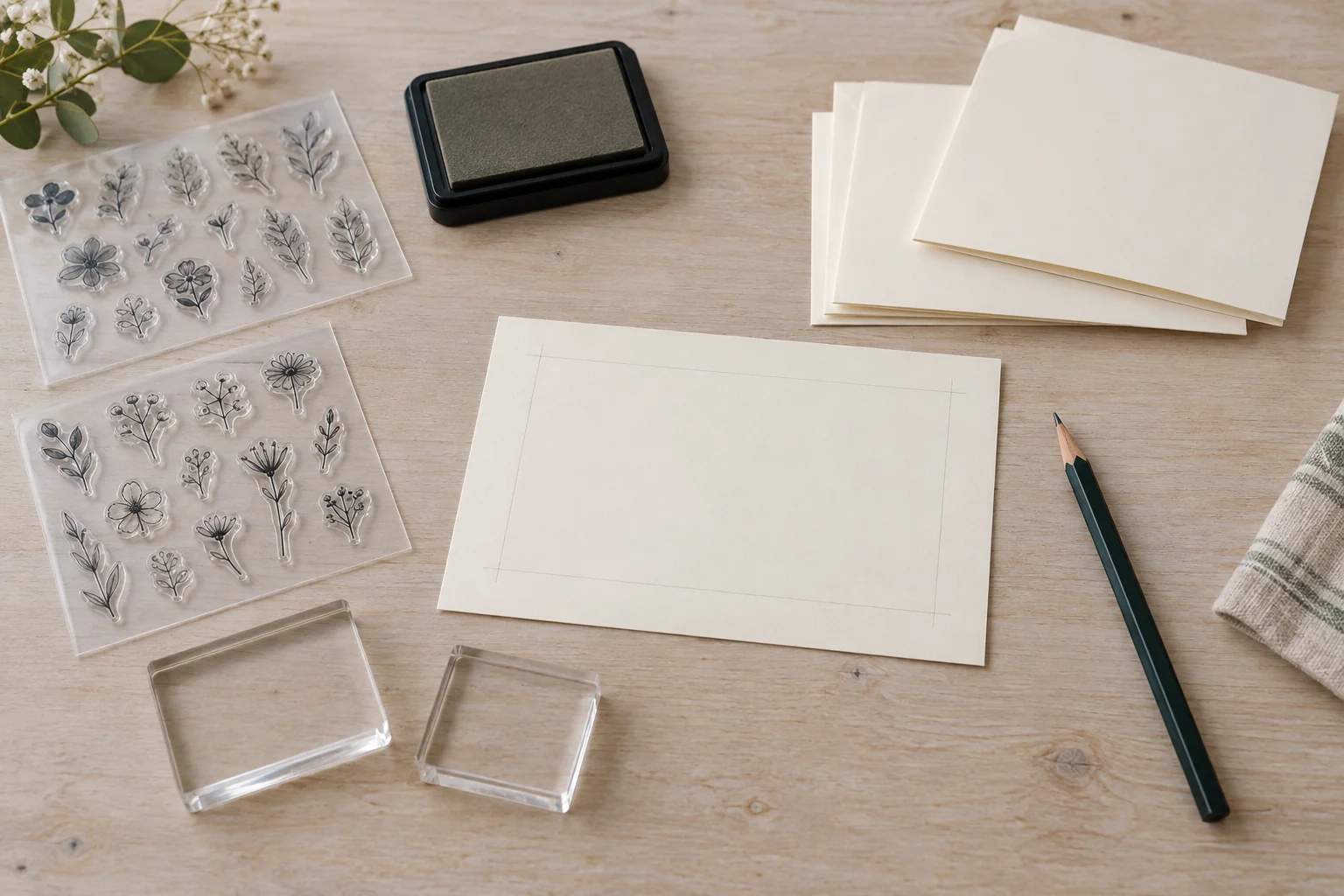
To plan a stamped border around a short message, settle the words first and reserve a readable area for them. Then work outward with the motif you actually want to use. A scrap-paper layout lets you change spacing, orientation and wording before preparing a finished card or label.
This tutorial concerns that paper layout and its review. For any actual impression, use compatible materials and follow the applicable stamp, block and ink instructions. The two Recollections offers below require a separate clear or acrylic block. Their sheet and package dimensions do not establish the printed size of every individual motif or letter.
1. Write the message before drawing its border
Choose the person who will read the finished piece and what you want it to say. A small greeting, a name or a label can give the layout a clear purpose. Write the exact proposed wording on ordinary draft paper first. Check any name or quoted wording against an identifiable source before arranging decorative elements around it.
Keep the first message short enough that you can discuss its placement as one thought. For an explicitly fictional example, imagine a card reading “For Maya, with thanks.” The name and the appreciation belong together. The border will surround that thought, so its shape should leave enough room to read the complete phrase.
If the draft feels cramped before there is any decoration, shorten unnecessary wording or choose a larger suitable presentation. Shortening the message can leave more room for both readable words and the intended flowers. You can also keep a longer personal message on a separate part of the card and use a shorter phrase for the decorated area.
2. Reserve the actual message area on scrap paper
Make a draft representing the paper size and orientation you intend to use. Mark which edge is the top. Place the message where a reader would encounter it, keeping any fold, opening or other relevant feature of the intended piece identifiable in your proposal. The drawing remains a layout until the actual materials have been checked.
Draw a loose boundary around the space the words need. This is a planning mark, so it need not become part of the finished design. Leave room around the lettering rather than making the boundary touch it. You can later compare more open and more compact arrangements on the same paper.
If you will write the message by hand, draft it in your own ordinary lettering at the intended size. If you intend to use alphabet stamps, establish the actual characters and their impression sizes from appropriate product information or an applicable trial. A storage-sheet dimension cannot replace the size of the word you want to print.
3. Read the floral and alphabet offers as different supplies
The Recollections 96723 floral border offer describes clear acrylic stamps, six packs with sixteen stamps per pack, and a separate clear block. It lists a sheet size of 9.45 by 4 inches, alongside different listing-size wording. Neither figure supplies a measured impression size for each flower or border element.
The Recollections GS-320254 typewriter alphabet offer describes six packs with sixty-seven stamps per pack and use with an acrylic block. Its stated sheet size is 4.75 by 5.5 inches. Ask what the separate listing dimensions measure before using them to plan a printed word. The alphabet and floral sets provide different design elements.
Choose the actual motif or letters before deciding how many repeated positions to put in your layout. A package containing many stamps does not tell you that each design is repeated within one pack. Confirm the actual inventory when a repeated character or matching pair of motifs matters to your plan.
4. Compare two approaches to stamped border spacing
For stamped border spacing, begin with one edge of the message area. Draw simple stand-in shapes representing the intended motif at its established size. One proposal might repeat an element along that edge. Another might place an element only near each end. Keep the same message so you can compare the effect of the border itself.
Look at the gaps between adjacent shapes and between the shapes and the words. You may prefer a steady visual interval or a looser arrangement with more empty space. Choose deliberately on the draft. There is no universal gap that suits every motif, paper size and message.
For the fictional Maya card, imagine a repeated floral element along the lower edge and a separate proposal with only two floral accents. The repeated version gives the edge more visible activity. The two-accent version leaves more empty space. Those are proposed compositions, without a claim that a particular retail stamp has produced either result.
If the last shape would crowd the corner, revise the spacing across the whole edge or reduce the number of elements. Do that on the paper plan before committing to the finished piece. You can also leave the corner open if you like how it looks. You can leave part of the card undecorated if you prefer the more open arrangement.
5. Move paper stand-ins before settling the arrangement
Use separate small pieces of scrap paper as movable stand-ins for the motif positions. Mark each with a simple outline and its intended orientation. Base their footprints on the actual motif information or applicable proof you have established. These are layout markers, so detailed drawings of every petal are unnecessary.
Place the markers beside the message area on your full-size draft. Move one closer to its neighbour, then move the pair away from the words. Look at what each change does to the empty space. Working with movable markers lets you compare positions without redrawing the entire border whenever you change your mind.
Keep the underlying message fixed while comparing those positions. If you move the words and every marker at once, it becomes harder to identify which change improved the arrangement. Try one adjustment, look at the complete draft, then decide whether to retain it before trying the next.
Once you prefer an arrangement, note where the markers sit on the draft. You can draw their outlines or make a small diagram that you understand. Keep the top edge identified so the plan retains its orientation when you clear the table. The diagram records your chosen positions without becoming a claim that an actual impression has been made there.
Leave an alternative aside rather than mixing its markers into the selected version. You can return to it if the later applicable proof raises a new spacing question. Compare it against the same message so the design decision remains clear.
6. Decide what happens at the corners
A motif moving along a long edge may meet a shorter edge awkwardly. Mark that junction on the draft and decide whether to continue the repeated pattern, leave a gap or use a separate accent. Judge the actual arrangement you are proposing. The name floral border does not establish a ready-made corner piece in the selected inventory.
Keep a motif's orientation visible in the drawing. A shape turned toward the message and one turned outward can give the card a different appearance. Choose which arrangement you enjoy while preserving the room the message needs. Follow the actual product guidance for any eventual positioning and printing.
Compare adjacent corners rather than assuming every edge must repeat the same number of motifs. The paper's proportions may give a long edge more room. You can keep a visual relationship through the chosen motif and spacing while allowing the counts to differ. Compare the complete arrangement with the message in place before changing an edge simply to match a count.
7. Check the alphabet stamp message layout
For an alphabet stamp message layout, write out every character in the intended phrase and check the actual set's inventory. A name may repeat a letter. A phrase may need punctuation that you have not yet identified. Resolve those supply questions under the applicable instructions rather than assuming a large total count includes every character you need.
Place the proposed word within the reserved area using established character sizes or an applicable actual proof. Keep the spacing between letters separate from the gap between words. A message can contain every correct character and still need a clearer word break. Read the whole phrase instead of checking each letter only in isolation.
Ask a second reader to read the proposed message without first telling them what it says. If they hesitate over a name or a word boundary, ask which part was unclear. Their answer can show where the layout needs attention. Use that reader's hesitation to revise the draft they actually saw; it does not measure the stamp set's accuracy.
8. Review the message before the decoration
Place the draft in the orientation its intended reader will use. Look for the message first. If the border attracts attention so strongly that the words become difficult to locate, compare a simpler version. You might remove a repeated element or give the centre more room. Choose the change that helps this particular message remain clear.
The storage bin label design guide similarly begins with words another person can understand, then examines hierarchy and placement. Its Dell desktop and printer references do not establish stamp compatibility. The useful connection here is checking the actual reader's task before treating decoration or production equipment as the answer.
The postcard-writing afternoon guide develops a message for a particular recipient before choosing its presentation. Its Compulabel and Avery print media belong to those actual offers. Use that writing exercise if your planned greeting still needs a personal detail before you settle the border.
9. Keep the approved draft beside the finished-piece plan
Choose the version whose wording, open area and motif arrangement you want to carry forward. Mark the draft so you can distinguish it from the alternatives. Retain any unresolved material or equipment question. A selected drawing does not establish ink suitability, actual block fit or a care method for the supplies.
Before making a finished piece, use the actual supplies' applicable instructions and confirm the requirements still open in your plan. This guide gives no cleaning chemical, mounting adhesive, stamp-carving method or heat process. A change of paper, ink or stamp creates a combination that needs its own applicable information.
If an actual permitted proof differs from the drawing, revise the layout to reflect the real result before proceeding. A motif may occupy more room than your early sketch allowed, or a phrase may need a wider centre. Check the revised layout against the wording you approved so a spacing adjustment does not accidentally change the message.
Finish the work to plan a stamped border with a draft you can read, the exact message checked and the intended motif arrangement visible. That gives you a specific design to take into the actual materials' printing process, with the remaining product questions clearly identified.
Conceptual materials to plan a stamped border, with generic inactive blocks, stamp sheets and blank paper; no exact models or tested print result is shown.