Home & Living
Halloween doormat ideas: sugar-skull graphics or a Boo greeting?
Choose between repeated sugar-skull artwork and a short Boo word greeting for a Halloween threshold, using the actual approach view and the captured offers.
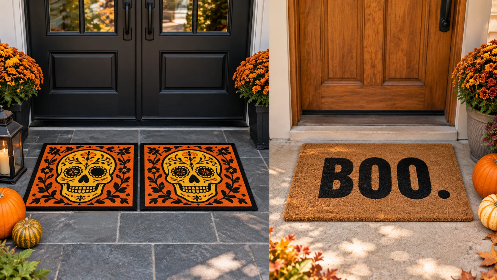
Halloween doormat ideas can be surprisingly hard to judge from a product thumbnail. A mat sits below a visitor's eye line, may be crossed almost as soon as it is noticed, and often shares the doorway with shoes, pots, or a door that opens over it. The first question here is what the floor should say during that brief approach. A matching pair of sugar-skull graphics gives the entrance a picture. A coir mat with the word “Boo” gives it a short written greeting. These are different ways to make a Halloween threshold feel deliberate, even before you compare their catalog measurements.
The two captured offers show the distinction clearly. The THISWEAR Halloween Rugs A-P-S-DMT-0024-02 listing describes two matching sugar-skull doormats. Its native image shows the same yellow skull on each orange and black mat. The other listing, Unbranded 24-inch by 48-inch Coconut Coir Rugs, describes a Boo Halloween door mat. Its first gallery image shows large black BOO lettering on a coir-colored field. This article stays with that picture-versus-word decision. The holiday entry doormat size guide owns the separate question of whether one large mat or two small ones fit a particular landing.
Decide what a person should notice first
Stand where someone normally approaches the door and look at the floor, not at a close-up product image. Is there a clear view of the whole mat before the visitor reaches it? Is the view from straight ahead or from the side? A word needs a readable orientation. A skull graphic can still register as a graphic when someone sees it at an angle, although the captured image cannot tell you how far away either design will be noticed at your home. Those questions belong to the actual entrance.
Try writing a one-sentence brief in ordinary language: “I want a Halloween picture at the threshold,” or “I want the entry to say Boo.” The wording is useful because the two offers do not communicate in the same way. The THISWEAR design depends on recognizing a stylized skull, its bright central face, and the surrounding pattern. The Boo design depends on reading three large letters. A visitor who sees only a corner or a small strip of the mat may receive very little of either message. Check the approach view before treating either listing photo as a preview of your doorstep.
There is also a difference between looking at the mat while walking toward the house and seeing it from inside as the door opens. If the written greeting matters most, decide which side of the threshold should read it upright. The gallery shows one orientation, but a seller photo does not choose the orientation for your doorway. A mat that is turned to serve an inside view may look upside down to someone arriving. The graphic pair has no word to turn, though the skull faces still have a top and bottom. This is a simple site decision you can make without claiming one product performs better.
Read the sugar-skull pair as a picture
The THISWEAR sugar-skull two-pack is described on its native Product page as two multicolor doormats. The listing gives 29 by 15 inches and one-quarter-inch thickness for each mat. The captured image shows two matching rectangular pieces, each with a yellow skull face over an orange patterned field and a black border. It does not show two different Halloween scenes. If you are drawn to the listing because you expect a varied set, the current gallery gives you a reason to verify that expectation before ordering.
A matched pair can create repetition at two separate thresholds, such as a front entrance and a covered side entrance, if both locations suit the product instructions. It can also leave one unused. Neither choice requires placing the mats side by side. For this visual decision, think about where the repeated picture would be seen rather than how to make two pieces imitate one larger mat. The latter is a floor-layout question covered by the size guide. Here the package count matters because the same image is supplied twice, allowing a repeated greeting if you have two appropriate locations.
The native description says the artwork is imprinted on the front in full color using sublimation. It also calls the design fade resistant, lead free, and suitable for indoor or outdoor use. Those are seller statements. The captured listing and gallery do not measure color change after a season outside, establish how the printed face behaves under wet shoes, or prove suitability for every exposed porch. If the graphic's colors are the main reason to buy, ask for current care and placement instructions and decide how much exposure your particular spot receives. A photo is good evidence of the pictured artwork; it is not a wear test.
Look closely at the image as a graphic composition. The skull occupies the middle of each mat, while the orange and black pattern fills the space around it. The face is the part most likely to carry the Halloween cue for someone who catches a quick glimpse. That is a reading of the supplied artwork, not a measured visibility claim. You may prefer that concentrated picture if the doorway already has a written sign or a wreath. You may prefer it simply because you do not want words on the floor. Both are taste decisions you can make from the captured image and your own entry.
Read Boo as a word at the threshold
The Boo coconut-coir mat uses a much shorter visual message. The first native image shows black BOO lettering, with a period, on a brown coir-colored mat. The word sits toward one side of the pictured mat rather than filling the whole rectangle. That image gives you a concrete design to judge. It does not show how the letters will look after a visitor has walked over them or how they will read from a particular distance in your entry.
A word greeting asks you to make one extra decision: whom is it addressing? If the normal approach is straight toward the door, place a paper rectangle on the ground with BOO written on it at roughly the pictured orientation and walk up from the usual path. This is a way to check sightline and direction at home. It is not a substitute for the seller's exact dimensions, backing instructions, or the physical mat. If people approach from a side path, repeat the check from that side. A three-letter word can feel immediate in the product photograph and still be partly hidden by a pot or a parked pair of shoes in a real doorway.
The native description identifies natural coconut coir, a stated 15-millimeter thickness, and a PVC backing described as anti-slip. It lists the Boo design as a funny welcome mat for fall or autumn decor. Treat the backing term as a product description, not a guarantee that the mat will resist movement on your tile, wood, concrete, or wet landing. The source does not report a floor-specific traction test. Follow the current seller instructions for the exact floor and weather exposure; if those details are missing, ask before relying on the backing claim.
The captured title names a 24-by-48-inch version. One gallery image shows the Boo mat. The second is a generic size chart that includes other dimensions; it does not verify that the pictured chart applies to the selected 24-by-48-inch variation. If exact dimensions determine whether a word will sit in a readable position at your door, confirm the variation and measurements with the current product page or seller. Avoid using the generic chart as proof of the selected size. A large-looking staged image can make the letters seem more prominent than they would be on your own floor.
Check the view without turning it into a performance claim
The floor changes how a design is read. A door may hide part of a mat when open. Shoes can cover a corner. A step or railing can make a person look down only at the last moment. Walk the actual approach once in daylight and once under the lighting normally present when guests arrive. Notice where your eye lands before you start measuring a product against a photograph. You are testing your entrance, not testing the seller's mat. The captured pages give no measured visibility or night-use data for either design.
For the skull pair, ask whether a centered face would be seen as a whole at that moment. If only half the area is normally visible, the strong center motif may lose its effect. For Boo, ask whether the letters would face the arriving person and whether another object would block part of the word. A pot could hide a letter and change the joke. These observations may tell you to clear a small visual obstruction, choose a different spot permitted by the product instructions, or choose the other style. Do not move a mat into an awkward walking path merely to improve the picture.
Keep the meaning of “greeting” modest. Neither listing says visitors will feel welcomed, amused, or frightened. The images show what the products depict. Your household decides whether a skull motif or the word Boo fits the people who use the entrance. If a building has shared access, a narrow landing, or limits on decorations, those constraints come first. Confirm the relevant rules and the available flat surface before buying a floor decoration for a common passage.
There is a useful distinction from a window display. The Halloween window-cling visual guide compares motif assortments and repeated eyes on glass. A doormat is seen below the eye line, crossed on the way in, and partly obscured during ordinary entry. That is why word orientation and the brief floor-level view matter here. This article does not borrow the window guide's piece-count or pane-coverage decision.
Use the listed construction details for questions
The two listings name different constructions: a printed THISWEAR two-pack with a stated quarter-inch thickness and a coir Boo mat with a stated 15-millimeter thickness and PVC backing. Those numbers identify the offers and raise practical questions. They do not by themselves establish door clearance, moisture behavior, cleaning method, or slip resistance. Do not infer that the thinner listing will always clear a door or that the coir listing will catch more grit. The actual threshold, door sweep, floor finish, and current product instructions matter.
If either mat will sit where a door swings, check the physical clearance with the door open through its full path before committing to a placement. A published thickness is only one input. If the area is exposed to rain, ask the seller for use and care limits for that exact product. The THISWEAR page says indoor or outdoor use, but it does not describe your porch. The Boo page's coir and PVC description does not state that it is right for every weather condition. A seller can clarify intended placement; you can inspect the actual doorway.
Package identity is another sensible question. The THISWEAR page says two mats with the same artwork. Verify the selected option still includes both, especially if you plan to use the repeated image at two entrances. The Boo page presents one mat with a selected-size title, while its generic size-chart image introduces uncertainty about variation. Confirm what size and design the current cart contains. Neither captured page establishes current stock, price, delivery timing, or what will arrive in a later order. A saved listing is a research snapshot.
If your real problem is grit continuing past an existing mat, start with the entry-mat walking-path guide. It traces the path of dirt and asks whether an indoor runner has a role. A Halloween graphic choice cannot establish dirt-control performance. Choose the visual greeting here, then address a separate functional concern with evidence suited to that concern.
Choose the greeting you can actually see at your door
Return to the approach view. If you want a repeated picture, have two suitable locations, and like the exact skull art shown in the native gallery, the THISWEAR pair is the offer to inspect. Confirm that the order contains two matching mats and that the current care information suits each location. If you want a short written greeting, the Boo coir offer makes that message explicit. Confirm the selected variation, orient the word for the person who approaches, and obtain any missing floor and exposure instructions before ordering.
Neither choice needs an invented score for friendliness, visibility, or durability. The captured art and descriptions support a smaller, clearer decision: picture or word at this threshold. A quick walk toward your own door, followed by a check of the exact current listing, will tell you more about that decision than a staged image alone.