Sewing & Crafts
Choose a facing pattern for an original teacup drawing
An original teacup-and-saucer drawing receives a decorative companion page, with the finished picture held steady while the pattern changes.
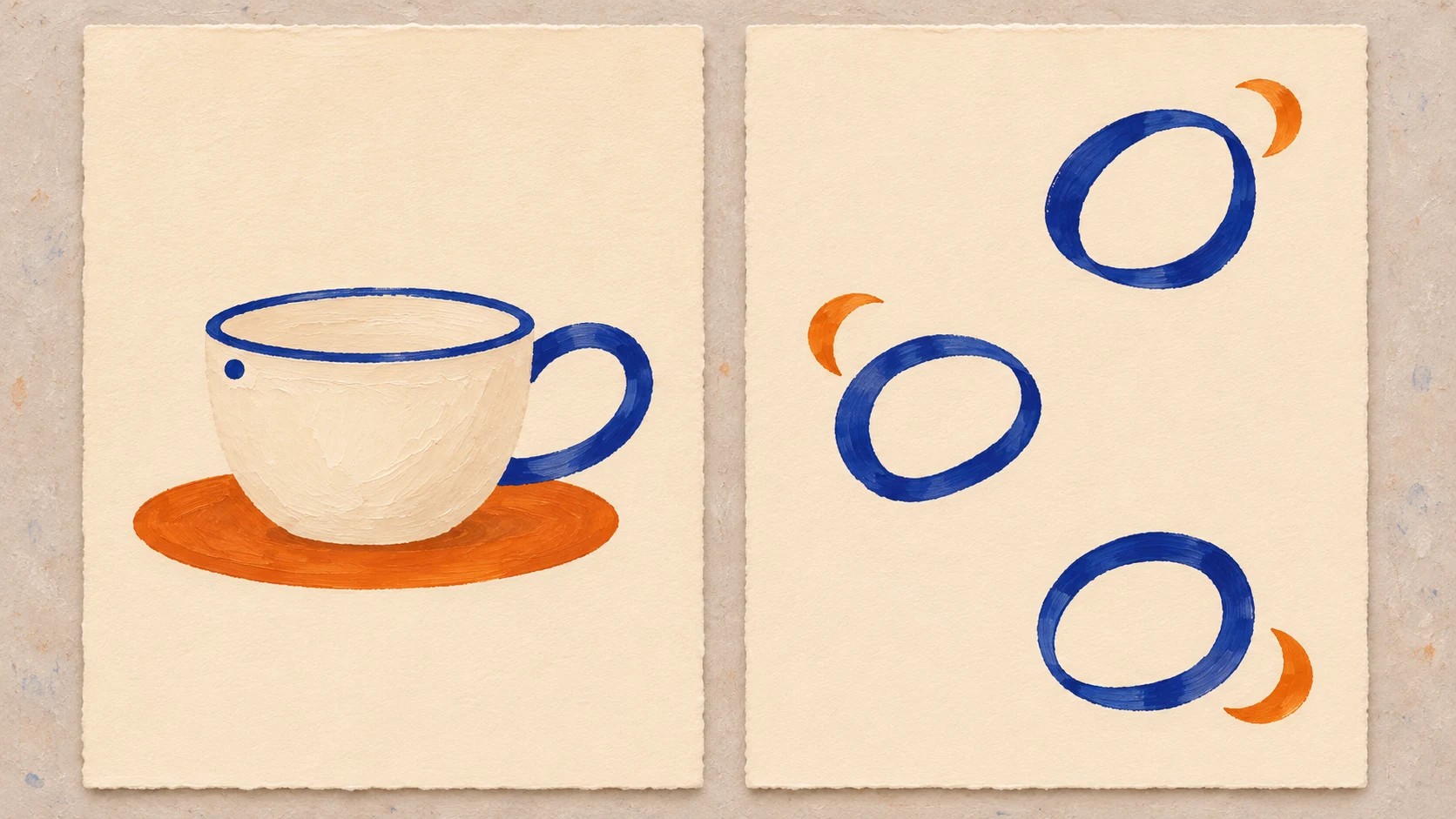
The facing pattern in this original art study accompanies a small teacup drawing. I have chosen loose blue loops with little orange crescents, leaving broad areas of the ivory ground untouched. The cup stays on its own page. The second page borrows selected marks from it without repeating the whole object. Putting the two drawings beside each other lets me choose how much company I want the cup to have.
The complete picture on the first page
The main drawing contains a squat cream teacup on a flat orange oval saucer. A narrow cobalt line runs along the cup’s rim, and a large cobalt loop makes its handle on the right. One small cobalt dot sits near the left side of the rim. Warm ivory surrounds the cup and saucer. There is no table edge, steam, person or written message. These are the complete chosen elements of the drawing, with no later event waiting on another page.
I like the uneven distribution of blue in this picture. The handle gives the right side a substantial open shape; the dot makes a much smaller blue interruption on the left. The thin rim passes between them. Orange has a different job: the saucer collects it into one broad, low form beneath the cup. I want the companion page to keep something of that relationship between an open blue shape and a flat orange one.
The cup’s cream body stays plain. Adding a floral decoration to it would create another motif to consider, and I prefer the present drawing’s small inventory. Its rounded body, open handle and low saucer give me enough to work with. I can describe the whole picture without needing an imagined owner or a story about the drink. My decision concerns these particular marks and the ornament I want alongside them.
Open loops
The open loops on the companion leaf come from the shape I chose for the handle. They remain detached marks, with no cup body joined to them. I set three at different heights on the same warm ivory ground. The upper loop leans slightly, the middle one opens more broadly, and the lower one sits a little away from the others. They belong to one loose family of shapes without becoming a row of identical emblems.
A small orange crescent sits near each blue loop. Each crescent stays outside the opening, with ivory showing between the two colors. I want to recognize the orange saucer’s flat presence without drawing three little saucers. The crescent gives me a small curved piece of orange that can accompany an open blue mark. It is a newly chosen ornament in this study, with no claim to represent a particular object.
I keep the openings pale because I like looking through them to the ground. When I imagine orange filling every blue loop, the marks become closed colored patches. That is a different pattern I could make, but it loses the hollow shape I wanted to borrow from the handle. In the selected version, the orange remains nearby and separate. The companion’s orange shapes therefore resemble the saucer in color and flatness while leaving the blue marks open.
The blank intervals matter to my choice. I place the upper and middle groups far enough apart that I can look at either without immediately meeting another mark beside it. The lower group sits in its own small area of ivory. I have not set a spacing formula or a required arrangement for other drawings. This is the particular sparse leaf I want beside the cup. A crowded ornament would give this pair a different character.
Companion page
The companion page has its own finished design. I would keep it as a separate leaf beside the picture, with both drawings upright. There is no need to turn one over to discover a second scene. The cup remains a cup on an orange saucer, and the loops remain decorative marks. Seeing them together gives me an association between shapes; it does not supply a hidden event or an explanation of what happened between two moments.
I prefer the cup at the left and the loose ornament at the right. In that order, I first meet the complete object and then see its handle-like shapes released from it. Reversing the order would let the abstract marks arrive first. That is a possible presentation, and it changes how I introduce my pair even though neither drawing changes. I keep the object first because I enjoy recognizing the borrowed curves on the second leaf.
The small blue dot on the cup does not need a matching dot on the companion. I considered that idea in the design; another set of tiny marks gave me more repetition than I wanted. I keep the dot as a detail of the primary picture. Choosing which element to leave behind is part of making the accompaniment. Reproducing every mark would turn my separate leaf into a catalogue of the first page.
The dense dot alternative
One alternative fills the companion field with blue and orange dots. The dots continue across the middle and toward the edges, leaving no large quiet patch of ivory. This would give the sparse cup picture a lively neighbor. I can see the appeal of the two different densities, especially if I wanted the second leaf to feel like a decorative lining. For the pair here, however, the many dots claim more of my attention than I want to give them.
The dot field also changes the source of the ornament. The cup has one small dot but a conspicuous open handle. Repeating the dot across an entire leaf takes that minor detail and promotes it into the companion’s main subject. That is a real design choice, not an error in borrowing. I prefer to keep the handle’s opening as the connection between the pages, so I set the dot version aside without altering the cup.
The repeated cup alternative
Another version scatters complete little cups over the companion. Each repeats a cream body, blue handle and orange saucer. This creates a miniature collection of the main picture. I find it cheerful, but it has the feel of a novelty print, and that is more literal than the accompaniment I want. The original cup already gives me the complete object. My chosen second leaf is more interesting to me when it carries only parts of the graphic vocabulary.
The distinction becomes clear around the orange shapes. A tiny complete cup needs its saucer underneath if it is going to repeat my original picture. An independent orange crescent can sit beside a loop, with no need to become a support for anything. The loose arrangement allows me to keep orange near blue in a way that the complete object does not. That freedom is the reason I choose the detached motif version.
Changing the field or adding a border
I considered an orange ground for the companion, with ivory loops and small blue crescents on it. That would make orange a broad area across the whole second leaf. In the selected pair, the saucer is the largest orange form, and I like leaving it that role. The orange-ground version gives the companion a much stronger presence. I would save it as a separate alternative instead of describing it as the same quiet design with its colors exchanged.
A blue line around the companion’s outside edge was another possibility. It could recall the cup’s rim while enclosing the loose marks. I chose to leave that line out. The border made the ornament feel contained in a panel, while the detached loops allowed the ivory to continue around them without an enclosure. I want to keep my attention on the open shapes. The primary picture already has a clear rim and a complete object outline.
The plain ivory leaf remains an option too. With no added marks, the cup would have an empty neighbor. I prefer the few blue loops and orange crescents because they give me a second drawing worth keeping beside the first. If I found myself adding enough detail to compete with the cup, I would return to that plain version before adding another ornament. It gives me a concrete alternative to compare with the selected sparse design.
Keep the completed pair in view
For this study I keep the cream cup, cobalt handle and rim, small dot and orange saucer unchanged. Beside them I retain the three loose open blue loops with their separate orange crescents. The other versions remain different designs: a dense dot field, repeated little cups, an orange ground, an enclosing border or a plain leaf. Naming the versions helps me discuss the choice I have actually made without claiming that one accompaniment suits every illustration.
Two earlier exercises use paired material differently. The two-caption drawing study attaches alternative imagined histories to one picture. The two-face cover study changes an invented scene between its faces. This teacup pair keeps its object and ornament separate and unchanged. Its connection is decorative, with no captioned event or narrative handoff to solve.
Optional paper references
You can develop the pair using a surface you already have. The Zaioo assorted cardstock account shows complete colored sheets with a printed 480-sheet, 24-color label. Its description also names other pack quantities. Those are offer and label claims, not a count of delivered sheets or a tested match for this drawing. The color choices in the original artwork do not establish which sheets an order contains.
The Bybiment brown cardstock account shows a complete stack labeled 120 sheets and 12 by 12. The native description also advertises 120 pieces of brown stock. I have not verified delivered quantity, weight, printing compatibility or drawing performance. The pictured text does not authenticate a maker or model, and the original ivory artwork is not presented as a result produced on these brown sheets.
Ordering through Republeq
You can make this art study without placing an order. If you later decide to buy supplies through republeq.com, identify the exact offer and the questions that matter to your intended use. A preference for cryptocurrency or USDT does not establish that a payment option is available for your order. Read the choices actually presented by the responsible service before proceeding. For the assorted paper, clarify the selected pack and its contents when the description names several quantities. For the brown paper, a photographed 120-sheet label remains a package claim rather than a count of delivered contents. Ask about unresolved product details before authorizing a purchase if those details affect your decision. Keep any answer with the offer and order reference it concerns. If a cryptocurrency option is actually offered, obtain the current asset, network, requested amount, receiving details and identifying order reference from that transaction’s applicable instructions. This article gives no receiving address, network choice, fee estimate or promise of acceptance or processing time. Review the delivery, cancellation, return and refund terms that apply to the selected order. Ask the responsible service to clarify an essential instruction you cannot reconcile, using a channel you have checked. Retain acknowledgements and records identifying any order and payment action you take. If an order or payment has uncertain status, reconcile what happened before considering another payment. An unresolved record does not establish that nothing occurred. If another person orders for you, give them the selected offer and outstanding questions, then retain the actual order reference for later correspondence about that transaction.